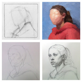
 |
Thumbnail sketch, Poster study
Block-in, Preparatory drawing |
In a previous blog post, I showed an overview of the painting process for the portrait of Tessa that I completed at the Ryder Studio earlier this year:
http://annawakitsch.blogspot.com/2013/04/painting-process-for-tessa-portrait.html
In this post, I will describe in more detail the first few stages of the process.
Composition
I arrived at the studio on Monday, February 10th, one week into the 6-week pose. The first thing I needed to do was to choose a spot. I chose a low easel at the right front corner of the model stand. I liked the three-quarter view of the face and the balance of light and shadow, reminiscent of Vermeer's
Girl with a Pearl Earring; and I realized that looking up at the model from a low angle at close distance would provide me with a perspective challenge.
The next task was to choose a format. I had prepared two potential painting supports: a 5" x 7" panel and a 6" x 6" panel, both mounted with extra-smooth portrait linen. In the past few years I have become comfortable working at this smaller scale. I also had a small viewfinder with a slider, to see how the composition would look cropped in different ways. Tony has always taught us that the poster study is a great compositional tool as well as a color map, and in this case he advised that if I couldn't decide between the two formats, I could do my poster study large enough to encompass more of the scene, and then decide how to crop it after I had established the value and color relationships. This was my plan. However, after experimenting with a few thumbnail sketches such as the one shown below, I quickly decided that I preferred the square format. The extra width would allow me to zoom in closer on the face while leaving room to fit in the waterfall of ponytail, the draped cowl of the hoodie, the stable base of the shoulders, and a bit of breathing room around the figure. I also liked how the strong diagonal pathways flowing through the pose added dynamic movement to the static regularity of the square.
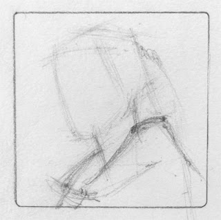 |
| Thumbnail sketch in graphite, approx. 2" square |
Poster Study
I was now ready to investigate color by painting a poster study. I wanted a study that was approximately 3" square, so I cut a piece of Canson Canva-Paper slightly larger than that and taped the edges to a piece of homosote board that was set up on my easel. I use the back side of the Canva-Paper, which is a little smoother than the front side. In the past, I've had trouble with the blue painter's tape sticking to the paper too well and tearing off the top layer. I recently acquired some purple painter's tape that is a bit less sticky, designed for more delicate surfaces. This seems to work well.
I didn't take progress shots of this poster study, but I'm working on a future blog post where I will demonstrate my approach. I started with a very quick brush drawing based on my thumbnail sketch. There are no details-- I don't put in eye sockets or lips or noses with this kind of study. I began with the darks in the hair and then moved on to the next lightest areas, until I'd reached the lightest lights in the face. Then I evaluated my choices, and repainted areas that needed adjustment until I was reasonably happy with the study. I planned to go over it one more time to correct a few more things after doing the preparatory drawing, but as it turned out, I left it as is.
A few of the things I keep in mind when doing a poster study:
- Very small scale. This doesn't suit everyone, but I prefer to size my studies between 2"-4". It's easier for me to take in the whole set of color relationships in the composition at once; I can cover the surface more quickly; and it reduces the temptation to add unnecessary detail (see next point).
- Minimal detail. I want to abstract the most essential color relationships and eliminate the distraction of drawing issues so that I can give color my full focus.
- Quality and direction of light. In this case, a large bank of fluorescents filled the space with clear, nearly color-balanced light and soft-edged shadows, similar to a skylight.
- Clean-edged, opaque paint patches. I usually avoid blending and transparency in this kind of study. I want to be clear and specific about my mixture for each area, so that I can easily identify its role in the composition and quickly determine the degree and direction of any adjustments that need to be made in terms of hue, value and chromatic intensity.
- Quick first pass. Because the poster study is all about relationships, it's difficult to judge the first brushstrokes until the whole thing is covered. Attempting to match each color in isolation is not enough-- it has to work with the other colors in the study to create the desired feeling of light. For each mixture, I make my best hypothesis about what will work, test it in the laboratory that is my canvas, and observe the interactions that happen. Once I am finished with the first pass, I spend the time and effort to re-evaluate and adjust as necessary until it "sings".
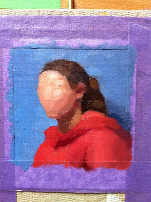 |
| Poster study, approx. 3" square, with purple painter's tape |
Preparatory Drawing
After completing the poster study, I moved on to the preparatory drawing on Wednesday of the first week. Working with graphite on toned Strathmore charcoal paper, I traced around my 6" square panel, lightly sketched in the initial construction lines and blocked in the pose. For the very first lines, I swung the pencil in gentle arcs to find the flowing diagonal movements that swept through the pose. I kept the shapes very broad and abstract at first, avoiding regular geometric shapes like squares and circles and instead choosing irregular shapes with dynamic, organic character. John Reger, who is one of the instructors at The Ryder Studio, helped me double-check the tilts and head shape for accuracy. When I began to block in the features, I first made "nests" for them. Instead of trying to drop the details of the eyes into an empty expanse of face, I first made broad subdivisions, looking for the larger forms around the eye sockets and lightly indicating landmarks like shadow edges and the contour of the brow.
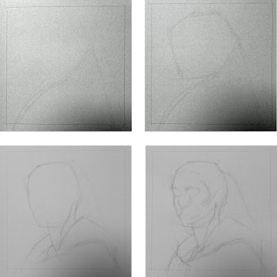 |
| Preparatory drawing block-in. Graphite on toned paper, 6" square. |
I continued to develop the drawing on Thursday and Friday. I had already moved the features around quite a bit, trying to get them right, but on Monday I took a fresh look and could see that I still needed to make some major corrections. I decided to overlay the existing drawing with a piece of translucent synthetic vellum (thanks, David!) and make the adjustments on the vellum. I wanted to be able to see the degree of change between the original and the corrections, rather than simply erasing the original.
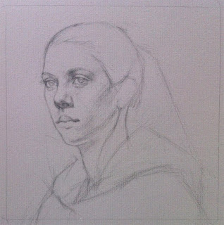 |
| Friday's efforts |
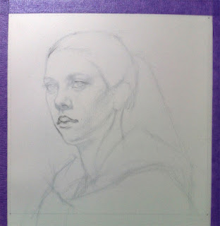 |
Beginning to make corrections.
You can see the original drawing slightly ghosted underneath the vellum. |
On Tuesday, Celeste Ryder gave me a critique and helped me determine that Tessa's left eye (the one on the viewer's right) needed to move up and in.
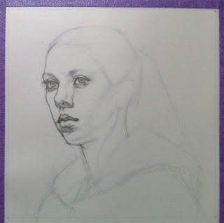 |
| Before critique |
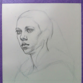 |
| Moving the eye |
By Wednesday, I was eager to begin painting. Although it was not a perfect likeness, I felt I had pushed the reference drawing far enough for it to be a helpful guide during the rest of the process.
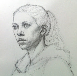 |
| Preparatory drawing on synthetic vellum, 6" x 6 |
In the next post, before going into the color wash stage, I will show how I transferred the outline of the figure to my panel with a homemade stencil, and then developed a finely detailed brush drawing within that outline.
**Update** I've finished the next post in the series:
http://annawakitsch.blogspot.com/2013/06/intermediate-stages-of-tessa-portrait.html


 Posts
Posts


