visit my website

Sunday, March 3, 2019

New Video: Making a Miniature Paper Room for Painting Reference


In this video, I'm making a paper maquette (scale model) of a room to refer to as I continue to develop my painting “Withdrawing Room I." I also chat about the architecture that inspired the painting, including the Thorne Miniature Rooms & 18th-century architect Robert Adam.
The much longer, more in-depth versions of these progress videos are available on Patreon: https://www.patreon.com/annawakitsch

Sunday, February 24, 2019

Save Leftover Oil Paint with Clove Oil!

How I save leftover oil paint, mixtures, and even the whole palette with a few drops of clove oil to keep it fresh and workable for weeks! 


Sunday, February 17, 2019

Latest mini-video: Color inspiration, research, and mixing for my current painting-in-progress!


Wednesday, February 13, 2019

Color Mixing with a Chromatic Triad: New Patreon Video


Color Mixing with a Chromatic Triad: the 2nd episode in my series of painting videos is now up on Patreon! https://www.patreon.com/annawakitsch
In this episode, I'm planning the addition of color to my currently monochrome painting "Withdrawing Room I". I'll be using a coffee cup as my color inspiration for the walls in the painting, and attempting to match the cup with oil paint.

Sunday, February 10, 2019

New Video (Painting in a Hemisphere) and Teaching Platform!

I've just started posting a new series of videos!  Mini studio vlogs will be available on my Youtube channel, and longer videos on Patreon, which I'll be using as a teaching platform and to share my process in depth: https://www.patreon.com/annawakitsch

Here is the first mini studio vlog!  https://youtu.be/Uq09gM6tfVQ


In this video, I'm working on an oil painting inside a hemisphere and adding an 18th-century dress (from a digital life study I did at the Metropolitan Museum of Art on my iPad).  This stage is a "grisaille" underpainting with neutral gray mixtures of oil paint.  

See more of my work on my website: https://www.annawakitsch.com
More in-depth, behind-the-scenes videos and tutorials on Patreon: https://www.patreon.com/annawakitsch
Instagram:  @annawakitsch   http://www.instagram.com/annawakitsch

Monday, April 4, 2016

New Work

Visit my website to see a selection of work from my first year of grad school at the New York Academy of Art.  These will be on view tonight, April 4, at our Tribeca Ball!

www.annawakitsch.com

Friday, December 12, 2014

Bad Sketches from NYC


Recently I made a visit to New York City, determined to do more sketching than snapping photos on my phone.  I don't usually sketch that often, partly out of fear of doing an embarrassingly bad sketch.

However, a few weeks before I left, I was really inspired by an episode of the Suggested Donation podcast featuring artist Steven Assael.  He encouraged artists to always carry a sketchbook, because even a bad drawing is a valuable experience that gets into your brain.

What he said reminded me of when I was with The Ryder Studio in Holland and Tony encouraged us to sketch at the museums, to go through the process of downloading all that aesthetic information.

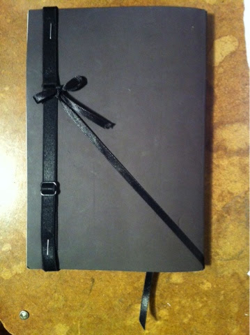
First, I searched for a toned paper sketchbook, and found one I liked (Strathmore Art Journal, 400 Series Toned Gray 80 lb. sketch paper, 112 pages, 5.5" x 8"), but it didn't have an elastic closure like I'm used to.  So I added one of my own by stapling an adjustable elastic headband to the back cover.  I added a ribbon bookmark too, threading the other end through the spine and tying it to the elastic.  I already loved the soft feel of the cover and the warm gray paper with subtle fibers creating visual texture, and my own customization made me even more eager to use it on my trip!


The first night, I looked out the window of where I was staying, and saw the beautiful, sparkling skyline.  I took a bunch of grainy camera phone photos, and then as I was getting ready for bed, I realized, "Oh no!!  I should have sketched it instead!"  So the next morning I got up at dawn and drew the skyline-- the first image in this post.

At the Metropolitan Museum of Art, there was an amazing costume exhibit, Death Becomes Her: A Century of Mourning Attire.  I went through the exhibit, then picked a dress to sketch from.


One of my reasons for making the trip was that I'm looking at graduate schools and MFA programs, and one of the schools I wanted to visit was the New York Academy of Art.  It was great to see the school and meet up with a good friend there, Abigail Schmidt.  While I was there, I was actually able to sit in on a drawing class with the very same Steven Assael who had inspired my determination to sketch more!  He encouraged the class to work from memory and imagination, as well as observation.  I did a tiny drawing from the model in my sketchbook.


I went to the Frick Collection to visit their three Vermeers.  I picked my favorite of the three to sketch.


The Museum at the Fashion Institute of Technology had an exhibit of Dance & Fashion.  Again, I went through the exhibit, took some notes, and then picked a costume to draw.


Back at the Met, I met up with Kristy Gordon to sketch together!  We did some thumbnail sketches and then also spent a little longer on a few things.


Also at the Met, I drew from a sculpture of Leda and the Swan, and did really quick scribbly sketches of some furniture.


It was an amazing trip, and it really enriched my experience to set aside my self-consciousness and take the time to sketch!


Teaching at Vitruvian Fine Art Studio in Chicago!

I'm excited to be teaching two Sunday classes at Vitruvian Fine Art Studio in Chicago starting in January: Block-in Bootcamp and Portrait Painting.
See their course schedule for more information on these and other classes they offer!
http://vitruvianstudio.com/art-classes-chicago/all-classes/


Monday, March 24, 2014

Studio Spring Cleaning Sale

Studio Spring Cleaning!
This spring I'm clearing out my studio of older sketches and studies, as well as trying to raise some funds for supplies and expenses to be able to continue with new work.  So far in Phase 1 of spring cleaning, I have gone through one of my 18" x 24" drawing pads from early 2006 classes with Tony Ryder.  Please visit my web store to browse through what I discovered and see if you find any portrait or figure drawings you'd like!


Friday, March 14, 2014

In Progress: Miniature pendant after da Vinci

It has a little ways to go yet, but I thought I'd share this in-progress photo of a new miniature pendant painting I'm working on.  It's a 1.5" diameter hand-painted study of the angel from Leonardo da Vinci's painting Virgin of the Rocks (National Gallery, London).  The completed study will be more developed and detailed, and then set into the pendant frame to display or wear as a necklace.  You can pre-order here: ThePearlPaintbrush.etsy.com.

In progress: Angel after da Vinci, oil on linen, 1.5" diameter


Friday, March 7, 2014

New Painting: The Glass Corner


Many thanks to my beautiful mom for posing!

The Glass Corner, 16" x 16", oil and acrylic on panel

Face detail from The Glass Corner

Hand detail from The Glass Corner

Tuesday, November 19, 2013

Etsy Shop Vacation

I will be accepting orders in my Etsy shop through November 25, after which I will be unable to ship items until mid-December.

Please visit ThePearlPaintbrush.Etsy.com to see what is currently available.


Friday, November 8, 2013

Details from Parameters painting

Enlarged details from my 9" x 7" oil painting, Parameters; currently in Nashville at Haynes Galleries for their small works show.
See the entire composition in my previous post:
http://annawakitsch.blogspot.com/2013/11/new-painting-parameters.html

Detail of satin skirt from 9" x 7" oil painting Parameters


Figure detail from 9" x 7" oil painting Parameters

Tuesday, November 5, 2013

New Painting: Parameters

Parameters, 9" x 7", oil on linen
My recently completed painting Parameters is currently in Nashville at Haynes Galleries for their small works show.

Thursday, September 12, 2013

Final Stage of Tessa Portrait: Form Painting

Details from color wash and form painting stages of Tessa portrait

This is the fourth in a series of blog posts detailing the process for a portrait of Tessa that I painted from life at The Ryder Studio earlier this year.  Here are the first three posts:
1. Overview
2. First stages: Thumbnail Sketch, Poster Study, Preparatory Drawing 
3. Intermediate stages: Stencil, Brush Drawing, and Color Wash 


ABOUT THE FORM PAINTING TECHNIQUE

Form painting is the final stage.  The values are usually a bit darker than the color wash.  Beginning with the darker areas and working toward the light, I complete one area at a time.  Paint is specifically mixed in progressions that turn each small form from dark to light.  

When form painting, I try to use the paint fairly opaquely and add just a touch of medium if the mixture feels stiff.  I mix on my palette with my brush, usually beginning with the darkest tone that I’ll need for the area I’m working on.  I place it on the canvas and make adjustments if necessary.  Then I mix the next lightest step in the progression next to and touching the first.  I place that on the canvas and make any adjustments, then continue on in the same way until I reach the lightest tone in that particular progression.  I usually lay in a base for the form in which I keep the very lightest values slightly darker than I want them to ultimately be.  Then I bring up those final values by brushing a lighter mixture into the underlying paint.


FORM PAINTING THE PORTRAIT OF TESSA

Completed color wash, before beginning form painting

I finished the color wash of Tessa on Wednesday of my 4th week.  I still had a little time before the end of the session, so I decided to begin the form painting the same way that I began the color wash: with the ear.

THE EAR

Ear anatomy terms

To get started, I carefully placed the darkest darks in the recessed concha and a few other areas bordering the ear.  I then treated my paint edges in preparation for the next day-- feathering some edges with a bit of solvent; and in other places, mixing an adjacent tone to begin the transition or progression into the neighboring areas.  Usually I try to resolve any edges as I go along, by painting a bit beyond them into the next area.  That way, at the end of each session, the area of form painting is integrated rather than stopping abruptly with hard edges.

Ear - Day 1

On Thursday I finished form-painting the ear and earrings.  I began the session by placing the darks in the furrow between the helix and anti-helix; then I connected those with the dark areas I had painted the day before, by painting the lighter anti-helix in between.  I continued on with the tragus, anti-tragus, and the lower part of the helix.

Ear - Day 2

I had been working around the earrings, and was now ready to pop them in—first the silver ball and then the faceted gem.  I used small creamy dabs of paint to create the reflections, adjusting the contrast as appropriate for each.  Next I laid in a base for the earlobe and then brushed in the light catching on each small sub-form.  Finally, I finished the top of the helix.  

Ear - End of day 2

THE JAW, CHEEKBONE, AND CHIN

On Friday I began with the shadow that runs along the jawline and casts onto the neck.  As I worked out to the underside of the chin, I shifted toward more intense coral-colored reflected light bouncing up from the chest and hoodie.  I also painted a bit of the blue background next to the chin and neck for color context and to fuse with the edges of the skin.


Beginning the jaw

As I moved up toward the underside of the near cheekbone, I noted that the forms under the cheekbone were catching a bit of diffuse light, but I was careful to keep the values in key so that they would not pop out too much.  I continued up the cheekbone and then the chin, turning the forms from shadow into the light. 


End of week 4

THE MOUTH

On Monday of my fifth and final week, I completed Tessa’s mouth.  I began with the chromatic darks in the vermilion zone of her upper lip (2), and then progressed up into the skin just past the vermilion border (3).  I then switched to the lower lip, placing the darker tones first (4) and and then turning up into the light (5).  Finally I dropped in the highlights on the lower lip (6).   Throughout the session, I tried to focus on how light washes across the larger underlying forms of the mouth area, rather than merely filling in a rose-colored lip-shaped outline. 


Mouth sequence


THE NOSE

I started the nose on Tuesday: first the underside, cast shadow, nostril cavities, and septum; then working up to the light on the tip and the wings.  I also completed the philtrum (the vertical groove extending from the base of the nose to the cupid's bow of the upper lip) and finished the upper lip area.


Base of nose; upper lip

THE CHEEKS


On Wednesday I began creating a nest for the eyes by painting the lower eyelids, and then I completed the cheeks.  When I’m painting a form from dark to light, I also think about painting up to the next dark downturn.  In this case, as I worked up from the underside of the cheekbone, before rolling all the way up to complete the lightest lights, I wanted to first (as Tony calls it) “corral” the lights by putting in the lower eyelids, which are not as light-facing and are therefore darker.  


Lower eyelid forms
Cheeks finished

THE BROW


On Thursday, I continued to make a nest for the eyes.  Getting the eyes to look right seems easier to me if I first paint the surrounding area for context, and then I can place them more accurately.  The next major downward-facing plane was the underside of the brow, so I began to work around the eyebrow forms and the glabella (the area connecting nose and forehead).  I also worked a little bit into the forehead and completed the bridge of the nose. 


Brows and glabella
Forehead, bridge of nose

THE EYES


We also had an evening session with Tessa on Thursday, and with only one more day left of the pose, I was eager to start on the eyes.  I already had the lower lids blocked in, so I began with her left upper eyelid.  These forms are very small, but getting them to curve convincingly around the eyeball requires careful attention to the shape and light distribution. 

Eyelashes won’t achieve optical realism if each is painted with a crisp black line.  Firstly, the lashes themselves vary in thickness and color from lash to lash, and each lash is usually thinner and lighter at its end than it is at its root.  They also tend to clump together in tapering and foreshortened shapes that curve to catch the light differently at each point.  Secondly, due to the resolution of our vision and the scattering of light, lashes visually soften and dissolve to varying degrees into the surrounding areas of shadow and light on the skin, iris, sclera (white of the eye), background, etc.  


Upper lid (Tessa's left eye)

The sclera is called the “white” of the eye, but is usually infused with a touch of the color of the skin, blood vessels, and ambient light.  It is part of a rounded form that drops in value as it receives less light. 

Tessa’s eyes are greenish, so for the iris I used a range of mixtures from bluish-gray to muted gold.  The border of the iris and sclera is soft rather than sharp.  This is due to several factors including the translucency of the sclera and, again, the resolution of vision and scattering of light. 

The highlight is placed on top of a base of slightly dimmer light, which creates a soft transition from the dark tones in the pupil and the shadow cast on the iris by the upper eyelid.  The shape of the highlight is curved as it maps to the form of the cornea.  In this pose it appears horizontally elongated.  The large bank of overhead fluorescents creates a roughly rectangular reflection, the top of which is truncated by the upper eyelid.

The rim of the lower eyelid is upturned toward the light, and is often close in value to the white of the eye but a touch pinker.


Completed left eye


I completed Tessa's left eye that evening, and Friday morning I approached her right eye in the same way.


Both eyes finished

FOREHEAD AND FINISH

After evaluating the painting and making some final adjustments, I quickly finished her forehead and hairline at the end of the session, and the portrait was done.


Portrait of Tessa, oil on linen, 6" x 6"

I hope you've enjoyed seeing the step-by-step process for my portrait of Tessa!